New 3D animated maps show hundreds of bird migrations
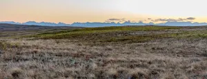
Birdwatching is a low-tech hobby: a pair of trusty binoculars, a notebook, pencil, and a bird identification guide are all that’s needed to get started.
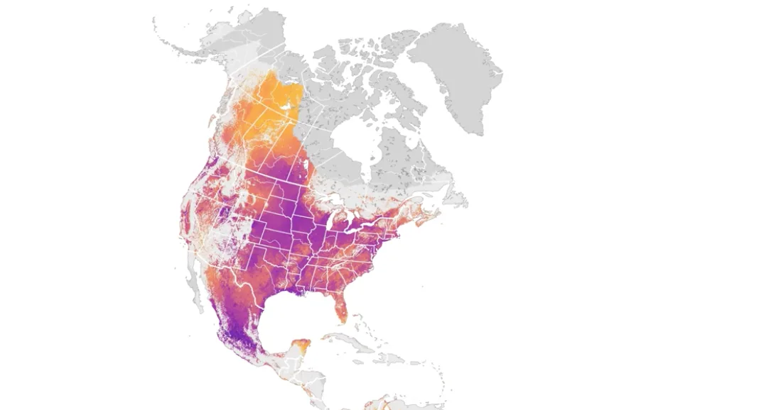
With assistance from high-tech satellite imagery and smartphones, the Cornell Lab of Ornithology has levelled up the old school birdwatcher’s checklist to create 3D animated maps showing the movements of 610 migratory birds across North and South America. This includes maps for iconic Canadian birds, such as the Common Loon, Trumpeter Swan, and Canada Warbler.
By combining volunteer-submitted bird sightings from the citizen science project eBird with imagery from NASA satellites, the Cornell Lab has created detailed maps showing the abundance and distribution of bird species during their migratory flights. These maps are available to researchers, conservation scientists, and educators to help understand the movement of birds across the Western hemisphere.
The maps wouldn’t have been possible without the many bird sightings submitted by birdwatchers to the eBird smartphone app. eBird is the largest biodiversity-based citizen science project in the world. Participants from around the globe, including Canadians, use the eBird smartphone app to create checklists of their bird sightings. Proving that many hands make light work, the eBird team was able to use five years of data from 179,297 bird watchers to generate their animated maps.
Because birdwatchers can’t be everywhere, the eBird team created models that could predict the movements of birds by associating locations from the eBird checklists with information about the surrounding landscapes, says Tom Auer, GIS developer with the Centre for Avian Population and Studies at the Cornell Lab of Ornithology. Combining the eBird checklist with data from NASA allowed Auer and the team to have “a more complete understanding of where birds are and how many birds there are.”
The model also includes nighttime light data from the National Oceanic and Atmospheric Administration to provide a “proxy for human footprint,” says Auer. This global data set uses nighttime light to show where humans have concentrated and impacted the landscape. Nighttime light is particularly important to note for tracking migratory birds, as it can act as a distraction. “This shows up in our models, where migratory land birds are getting drawn into the light of cities,” says Auer.
To help protect birds, it’s essential that the animated maps get into the hands of conservation organizations and government agencies. The Cornell Lab is also looking to expand the roster of animated bird maps to cover the Western hemisphere, and eventually the globe, he says.
“The thing we need the most is more data,” says Auer. That’s where citizen scientists come in; birdwatchers can help build new maps by submitting sightings through the eBird smartphone app.
For beginner birders, the Cornell Lab’s Merlin smartphone app is a great gateway to learn how to identify birds and begin contributing data. And don’t feel like you have to rush out and perform a marathon birdwatching session to contribute to scientific projects like this.
This article, written by By Grace Hunter, was originally published for Cottage Life.
Source: Cornell Lab of Ornithology