Over 100 years of Canadian climate at a glance

Every year on June 21, our summer solstice, hundreds of meteorologists and climatologists participate in the #ShowYourStripes movement to raise awareness about the urgency of climate change.
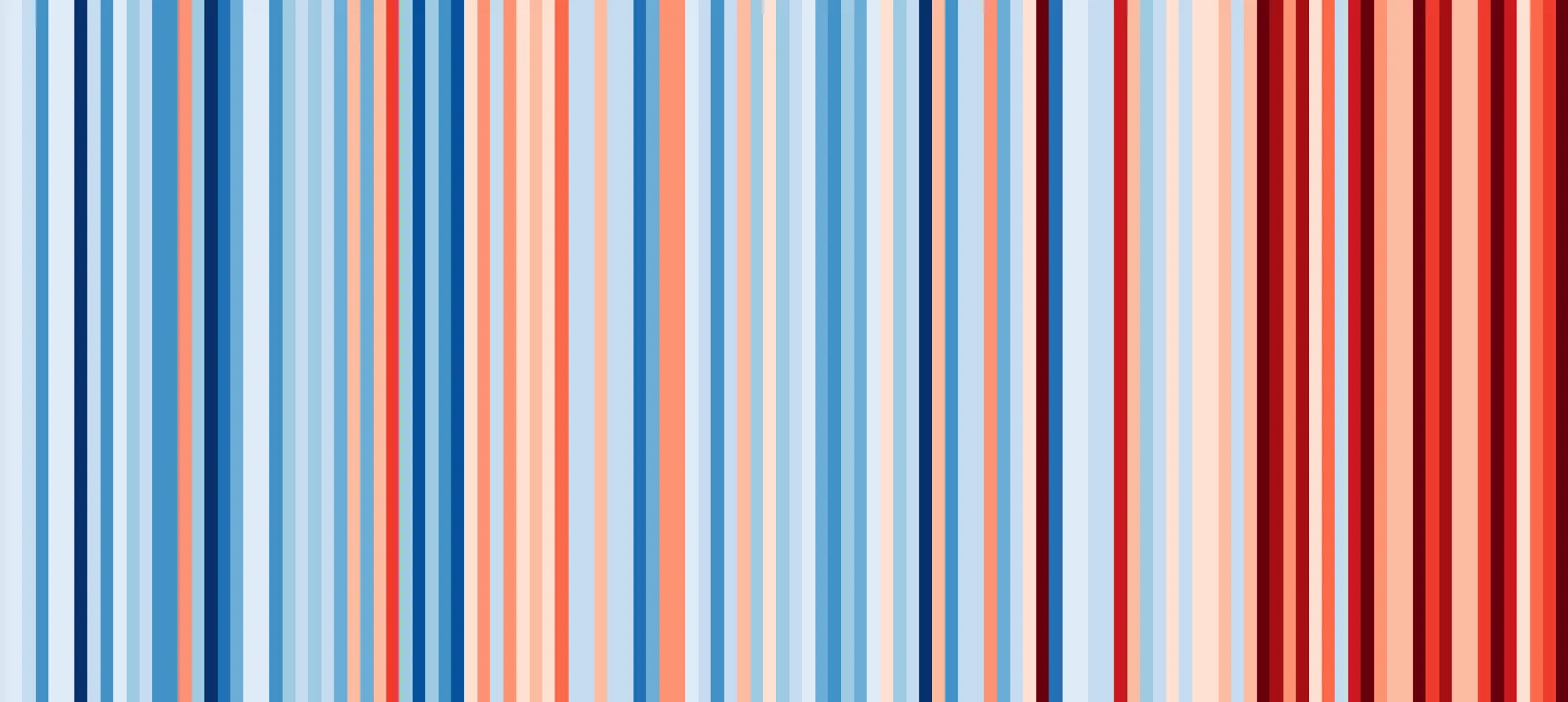
Warming Stripes are the brainchild of Ed Hawkins, a British climatologist who hoped to create a visual representation that could help illustrate changes of temperature over time and depict global warming trends in a simple, yet noticeable way. These are the Canadian and global versions of the graph.

The concept is quite simple: each stripe represents the average temperature of one year. Blue stripes are years where the average temperature was below the 1971-2000 average, red stripes were above average. The darker the color, the more significant the difference — dark blue are coldest (more than 2°C below average) and dark red hottest (more than 2°C above average).
Why are we comparing each year to the 30-year average between 1971 and 2000? The answer is representativeness. Climatologists always use a 30-year reference period. If we compared each year to 1900-1930, everything that follows would be red. If we used 1990-2020, everything before would turn blue.
And what do we observe? Canada began warming up sooner and faster than the whole planet. This is related to our latitude and the influence of slow-warming oceans on the global average.
We also see the fickle nature of climate change. The global average temperature may be increasing, but it does not mean we no longer experience cold years locally. 1982 was especially cold in Canada — our last dark blue year. 1998 was a tipping point, as we experienced the second strongest El Niño of this period (the strongest came in 2015-1016) and the impact of accumulating greenhouse gases in the atmosphere.
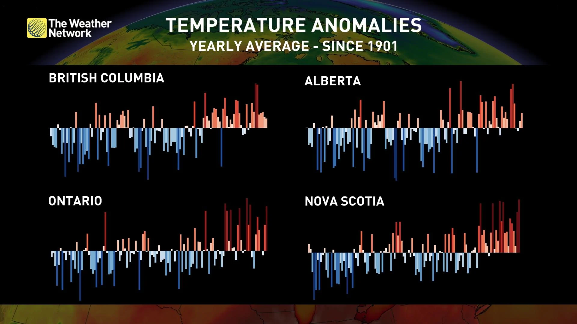
When you switch the graph format to show the importance of the differences from the average, the trends are even more striking, and provincial comparisons reveal some interesting variations. While temperatures rose in the 90s across Canada, regions in the center of the country — Ontario, the Prairies, Quebec — show slower warming and more recent cold years than the coasts (B.C. and the Maritimes). Northern areas like Nunavut experienced the most intense and early warming compared to the rest of the country.
The key thing to note is that temperatures that were once outliers have become the norm. Ontario had only two years over 2°C above average in the first 100 years of the graph, but 8 since the turn of the millennium.
Show your stripes today and join the weather and climate community in raising awareness of the urgency of the climate crisis. Find the stripes for your country and province at showyourstripes.info and repost them on your social media with #ShowYourStripes today.
Header image: Climate stripes for Canada 1901-2021 (Creative Commons, Ed Hawkins, University of Reading / Data from Berkeley Earth